Creating a Moving Average chart in D3
Moving Average Charts in D3
Recently, a large portion of my job involves building D3.js-based dashboards to help track different metrics over time. Since I work in advertising, a large majority of those metrics comprise of click-thru rates (# ads clicked / # ads shown) or conversion rates (# ads that led to a conversion event / # ads shown) of different advertising strategies.
The issue with clicks and conversion is that they are pretty rare events, so on a daily basis their estimates can fluctuate quite a bit. So if we put something like click-thru rates by data in a visualization, it ends up looking like this:
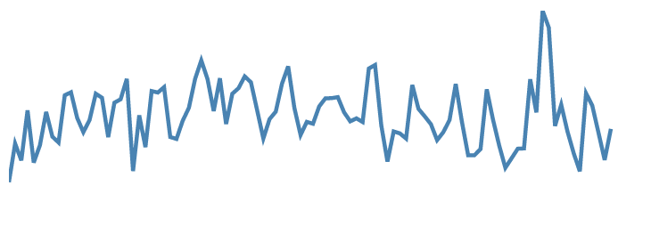
This sucks. It’s incredibly hard to detect if there’s any clear trend in the data. What’s the “average” click-thru? And what’s the deal with the spikes? Are those just normal fluctuations, or is it because of low impression volume? Hard to say.
So how do we do this? We could just calculate the moving average in the data before calling the visualization, but that puts extra overhead on the data pre-processing. And where’s the fun in that?
To address this, let’s create module that will display both the underlying data, and a smoothed moving average.
Coding time
Let’s start with a standard time series chart:
  var regularTimeSeries = function(){

    width = 450
    height = 150
    margin = {'top': 10, 'right':10, 'bottom':2, 'left':40}

    var yScale = d3.scale.linear()
              .range([height, 0])
    var xScale = d3.time.scale()
              .range([0, width])

    var line = d3.svg.line()
                .x(function(d){ return xScale(d.date) })
                .y(function(d){ return yScale(d.CTR) })


    setupScales = function(data){
      xScale.domain([d3.min(data, function(d){return d.date}), d3.max(data, function(d){return d.date}) ])
      yScale.domain([0, d3.max(data, function(d){return d.CTR}) ])
    }


    chart = function(selection){
      selection.each(function(data){

        setupScales(data)

        svg = selection.append("svg")
          .attr("width", width + margin.left + margin.right)
          .attr("height", height + margin.top + margin.bottom)

        svg.append("path")
            .attr('class','line')
            .attr("d", function(d){ return line(data) })
            .style("stroke","steelblue")
            .style("stroke-width", 3)
      })
    }
    return chart
  }


  var chart = regularTimeSeries()
  d3.select("#chart").data([data]).call(chart)
This is the exact code used to generate the visualization above. It’s assuming that the input data looks like this:

with CTR already calculated at each point in time. CTR is plotted on the y-axis, and date is on the x-axis (Note: I’m ignoring axis labels for this exercise.). The charting code is encapsulated in the regularTimeSeries function, and the last two lines generate the chart object and apply it on some data.
I’m skipping over most of the details of the code – I based the structure on on Mike Bostock’s reusuable charts framework, and also the multitude of on line charts in D3, so if you’re new to D3, I suggest you check that out before continuing. I’ve personally found d3noob and Scott Murray’s tutorials to be especially helpful.
Let’s modify this so it also plots a 7-day moving average, which should help smooth out the fluctuations.
We’ll start by adding some getter-setter methods that allow us to specify our x and y variables, and specify how to calculate the metric. This will help us recalculate the moving average CTR on each date.
chart.xVar = function(value){
  if (!arguments.length) return x
  xVar = value
  return chart
}

chart.yVar = function(value){
  if (!arguments.length) return y
  yVar = value
  return chart
}

chart.yCalc = function(value){
  if (!arguments.length) return yCalc
  yCalc = value
  return chart
}
chart.windowSize = function(value){
  if (!arguments.length) return windowSize
  windowSize = value
  return chart
}
I’ve also added a windowSize method that allows us to specify how many days to use for our moving average.
Now, our chart can be configured with those values specified, like so:
var chart = regularTimeSeries()
              .xVar("date")
              .yVar("CTR")
              .yCalc(function(d){return d.imps > 0 ? d.clicks/d.imps : 0})
              .windowSize(7)
d3.select("#chart").data([data]).call(chart)
With these specified, let’s add a function that will calculate a rolling sum of the data, based on the windowSize.
function rollingSum(data){

  data = data.sort(function(a,b){return d3.ascending(a[xVar],b[xVar])})

  var summed = data.map(function(d, i){

    var start = Math.max(0,i-windowSize)
    var end = i
    var sum = {}

    for (var key in d) {
      if (d.hasOwnProperty(key)) {
        sum[key] = key != xVar ? d3.sum(data.slice(start, end), function(x) {return x[key]}) : d[key]
      }
    }

    return sum
  })
  return summed
}
Taking that data as input, this will return an array that looks exactly the same, except that value at each data is the rolling sum of the past 7 days.
Now, we can easily apply the click-thru calculation on top of it, which we’ll also specify in a function:
function calculateYValue(data){

  data = data.map(function(d){
    d[yVar] = yCalc(d)
    return d
  })
  return data
}
Putting the above two functions together, we can come up with a new array of data that gives us a 7-day rolling sum of clicks and impressions, and a 7-day moving average of CTR based on these sums.
smoothedData = smooth(data)
smoothedData = calculateYValue(smoothedData)
Math Interlude:
We could also calculate the moving average of CTR as (CTR_1 + CTR_2 + ….+ CTR_n) / n; however, this puts equal weight on each date. This is undesirable in this case, because the number ads shown differ greatly on a day-to-day basis – days when 10 ads are shown shouldn’t get the same weight as days with 10,000 ads shown. Calculating the average as the rolling sum of clicks / rolling sum of ads allows us to overcome this bias.
The rest is pretty straightfoward – in chart(), we just need to add another path object that uses the smoothedData as its input source.
chart = function(selection){
  selection.each(function(data){


    smoothedData = smooth(data)
    data = calculateYValue(data)
    smoothedData = calculateYValue(smoothedData)

    setupScales(data)

    svg = selection.append("svg")
      .attr("width", width + margin.left + margin.right)
      .attr("height", height + margin.top + margin.bottom)

    svg.append("path")
        .attr('class','line')
        .attr("d", function(d){ return line(data) })
        .style("stroke","steelblue")
        .style("stroke-width", 1)
        .style("opacity", .75)

    svg.append("path")
        .attr('class','line')
        .attr("d", function(d){ return line(smoothedData) })
        .style("stroke","steelblue")
        .style("stroke-width", 5)
  })
}
We end up with a visualization that looks like this:
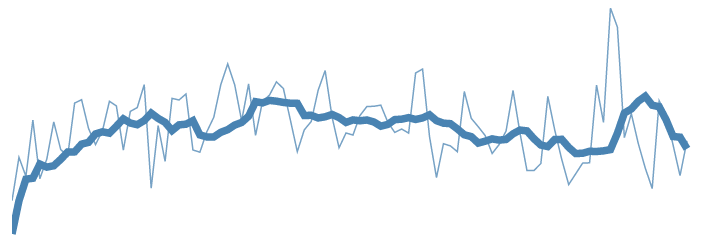
I’ve added some styling to emphasize the moving average line more, but this is much better! It’s much more clear where the trends are, and keeps us from being reactive to random spikes or drops.
Conclusion
This might be obvious to many, but smoothing your visualization matters helps a lot, especially when dealing with a lot of noise in the data.
Of course, you might need to be concerned about forcing trends that aren’t there, but that’s as discussion for another day ;).
Also, D3 is awesome!